3rd August 2015Comments are off for this post.

Newlyn Art Gallery and The Exchange

On this postgraduate placement I created a booklet based on the two exhibitions, Artist Rooms: Robert Therrien and In Search of the Miraculous. As well as researching both exhibitions, I wrote, designed and illustrated the booklet. I created questions to help viewers engage with the artwork and designed creative tasks for visitors to take part in during their visit.

23rd July 2015Comments are off for this post.

Think & Do Booklet

On the placement with Newlyn Art Gallery I am making a gallery guide for young people aged between 13-25 years. 
At the start of the project I had the idea to create a guide that felt like an artist scrap book. A mock-up of this idea can be viewed below. I felt this idea was appropriate as the aims of this guide was to help viewers engage with the art on display, to encourage curiosity and make the gallery space less intimidating to those unfamiliar with it. I believe the warmth looseness of a scrap book design like this would encourage creative thinking. However because of the very quick turnover I had for this project, it was not possible to do this. Instead I had to opt for the quickest medium to work with which is digital media. 
 

Although I could not go ahead with the idea I was set on, I am pleased with the result using digital media because it has created a simple, bold look and lets the illustrations capture the focal point. The colour scheme in the font reflect the colour scheme used in the galleries branding. 

5th April 2015Comments are off for this post.

Our Daily Rice

I have finalised a draft section in order to create a clear reference point for myself, using this mock-up to refer to, as it captures the narrative and illustrative voice I wish to embody through out the rest of the project. This section is at the centre of the rest of my script writing.  

7th March 2015Comments are off for this post.

Finding the characters

7th March 2015Comments are off for this post.

The Concealed Life

These are some of the drawings I have created whilst trying to develop the visual aesthetics for the graphic novel I am in the process of writing. 

I think that colour may appear in the panels that I want to symbolise a drastic change in atmosphere. 
But for the majority of the book I want to use blank and white, focusing instead on the intensity in the tones and the movement creates by the pencil.
I have decided to use lettering created by rubber stamps because of the crooked quality that comes with inking each letter and stamping it. 
In this drawing I start succeeding in making the drawings more loose and expressive and distorting the proportions so that the world I am recreating becomes unique but it is still recognisable. 
I created a few pen drawings and then dismissed the media because it did not create the intense movement I am after. 

In these last two drawings I created the style that I want use in the book. The proportions are distorted, from the figures to the scenery. One character has been transformed into a God like status because of their power within the narrative. 

7th March 2015Comments are off for this post.

Dancing on Clouds

6th March 2015Comments are off for this post.

Printmaking: Collagraph

This image was created using mountboard. Using a scalple, I cut out the shapes I wanted to be the darkest because it absorbs more ink. Then spread ink, and press onto paper. 

6th March 2015Comments are off for this post.

Printmaking: Etching

Etching using lots of chemicals on copper plate.

10th November 2014Comments are off for this post.

Bhoot

Bhoot is an authorial, biographical narrative that I am currently in the process of illustrating, with the aim to create a finished graphic novel. Bhoot is based on cultural folklore, passed down to me by my Mother and is based on my Grandfather, who I never met.

2nd September 2014Comments are off for this post.

Angel of Mons

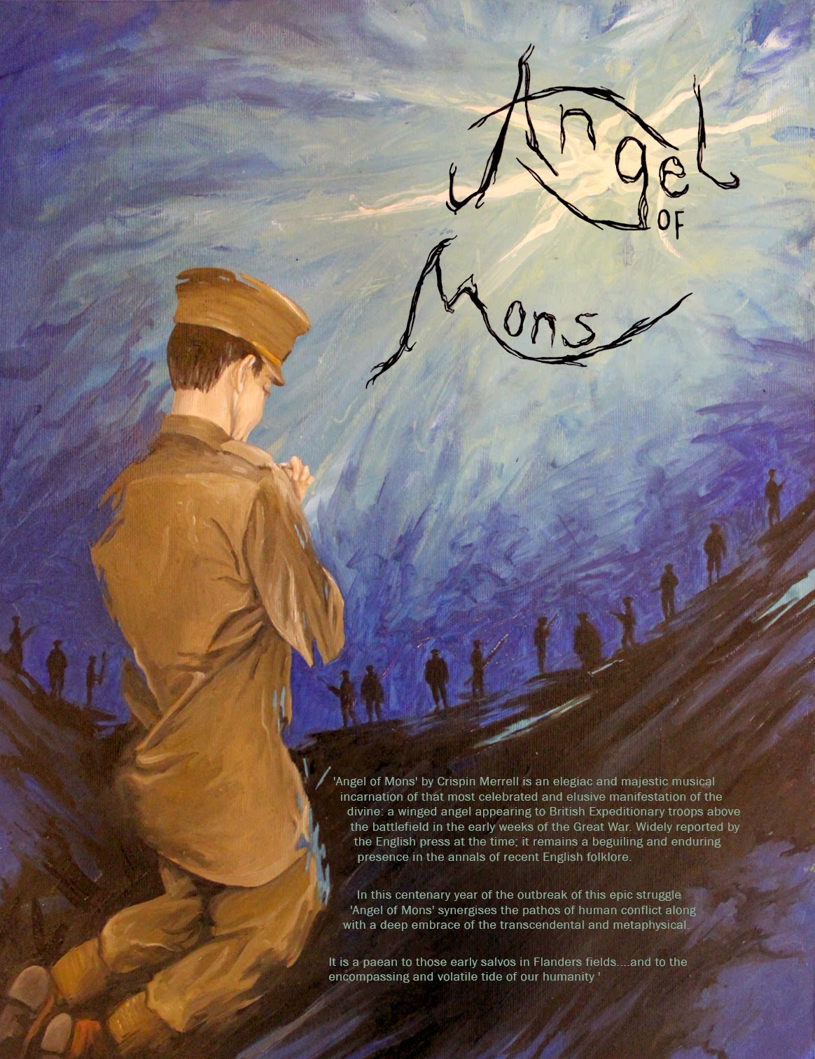
This project was a commission, in which I was asked to create a poster to accompany a piece of music, commemorating the anniversary of the ‘Angel of Mons’. In the early weeks of the Great War, a winged angel appearing to British Expeditionary troops above the battlefield, warning them to retreat.

Mock-ups 


The idea behind the mock-ups (above) is to capture the energy of the angel, representing this, instead of the physical form. 

Again, I have chosen to represent the angel metaphysically. A bursting ray of light shinning down on a soldier, quickly praying before he joins his comrades in the battlefield. 
The mock-up above takes a more literal approach. The sky is broken, by the descending angel, revealing outer space. The path coming down from the sky symbolised the road the soldiers retreated on. Researching the 'Angel of Mons', the images of the soldiers retreating stood out to me.  
The design above was chosen by the client to be finalised. In this design I choose to have an outline of the angel, not incorporating any features, as I thought this was a good balance between giving some information away but not too much. 


Above are all the text layouts I experimented with before I decided on the best placement. 
I thought that having the text in the silhouette of the head, subtracted too much from the background, and the text looked like it was floating too much, and the text in the background did not stand out enough. 

Final Poster